After a brief tangent to explore the Twitter data, I’m back to the city of Chicago neighborhood data. I was originally planning to use other data sets from the Chicago data portal to profile the neighborhoods, but instead I found a few other helpful data sources:
Census Fact Finder Download Center – This site has a lot of demographic data from the US Census Bureau, and many of the data sets can be downloaded at varying levels of detail, which is super helpful when you are specifically looking for zip code.
Federal Election Committee – I wanted to look at the political leanings of the various Chicago zip codes but I couldn’t find election result data at the zip code level, so this data set was a nice substitute. This contains all individual contributions to any political committee with the individual’s zip code included.
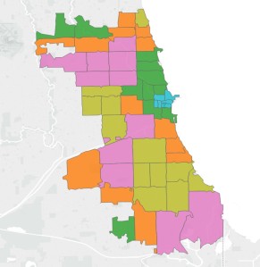
I created a master data set with data from the above sources, including things like age, race, income, political leaning, employment, % of population in various industries, commuting methods, etc. I then used k-means clustering to create groupings of neighborhoods that are similar demographically and this is what came out:
see interactive viz here
Key:
Cluster 1 : Not pictured, tiny zip codes with sparse data
Cluster 2: Orange – Sporadic
Cluster 3: Yellow – South and West
Cluster 4: Green – Surrounding Downtown
Cluster 5: Blue – Downtown
Cluster 6: Pink – Sporadic
Below are some charts displaying the demographic breakdowns of the various clusters:
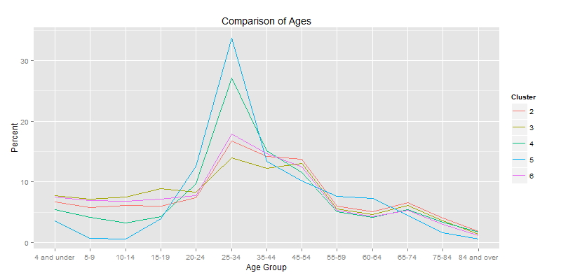
Cluster 5 has the largest percentage of 25-34 year olds and the lowest percentage of children under age 15. This makes sense considering these are largely the downtown zip codes. Cluster 4 follows this trend to a lesser degree, and clusters 2, 3 and 6 are all very similar in their age demographics with higher percentages of children and lower percentages of people aged 25-34.
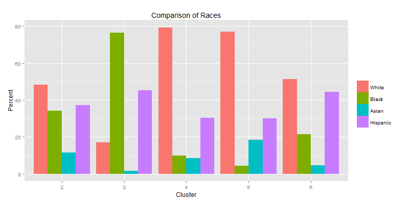
Looking at the race breakdown of each cluster, we can see that clusters 2 and 6 are the most diverse, while clusters 3, 4 and 5 tend to be dominated by one race.
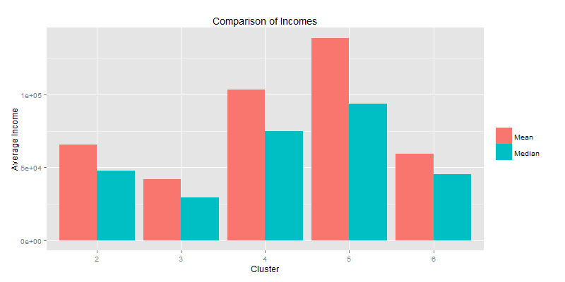
Cluster 5 is the wealthiest and also has the largest difference between mean and median salaries, which means that the wealth in these zip codes is not normally distributed. Instead this distribution has a long tail to the right, implying that there are some people in these zip codes that are making considerably more than most and pulling the mean up.
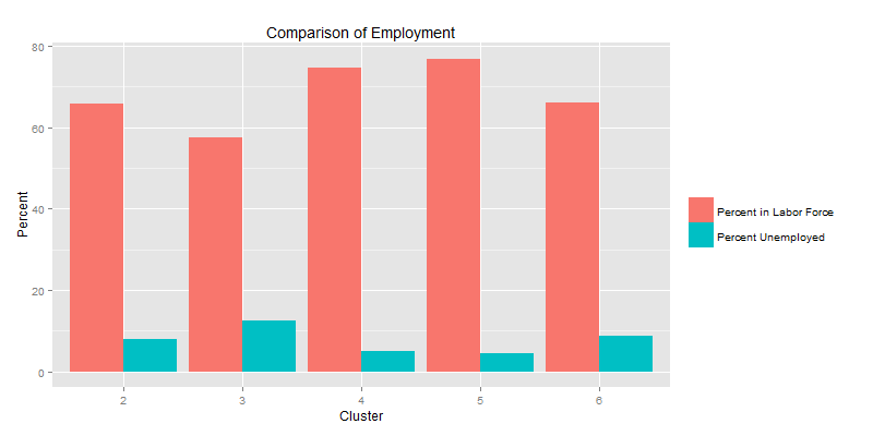
Cluster 5 has the largest percentage of people in the labor force, which given the age demographic of this cluster is not too surprising. Cluster 3 has the lowest, but this cluster also had the largest percentage of the population under 19, so also not too surprising.
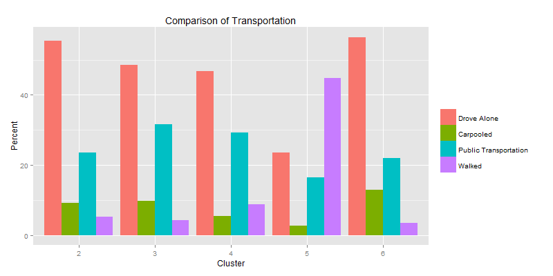
Cluster 5 contains the largest walking population by far, which isn’t too surprising considering these people live and most likely work downtown. Clusters 2 and 6 are very similar, mostly driving alone, and clusters 3 and 4 are similar in their transportation patterns as well, still mostly driving alone but with larger percentages of people choosing to take public transportation than clusters 2 and 6.
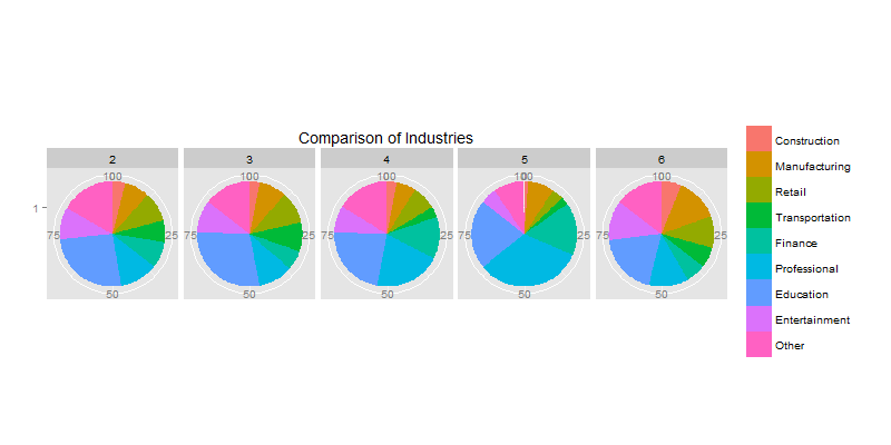 This chart displays the percentage of the population in each cluster that is employed in various industries. Clusters 2 and 3 are nearly identical in their industry breakdown. Cluster 4 is a middle ground between clusters 2 and 3 and cluster 5, with fewer people in manufacturing, retail and transportation than clusters 2 and 3 (thought not as little as cluster 5) and more people in finance and professional industries (though not as many as cluster 5). Cluster 5 has the largest percentage of the population in professional and finance realms and the fewest in the construction, manufacturing, retail, transportation and entertainment. Cluster 6 has the most equal distribution between industries.
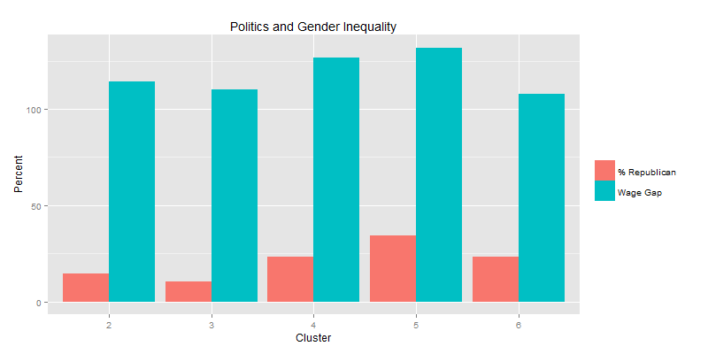
This chart displays the percentage of each cluster that is republican leaning (defined by the percent of contributions to political committees that went to republican committees) and the wage gap (defined by the male to female median salary ratio). Cluster 5 is both the most republican leaning, and also has the largest wage gap, where males in the work force make 131.8% more than females in the work force. Generally the wage gap decreases as the republican population decreases, however cluster 6 is an outlier to this pattern with the lowest wage gap and the second highest percent of republicans (tied with cluster 4).
Pingback: Mapping Tools | If you torture the data long enough, it will confess